Ghost in the Machine: How to Build a Billion-Dollar Brand Identity Without Hiring a Single Creative Agency (2026 Deep Dive)
Build a premium AI brand identity without hiring agencies. Learn 8 powerful moves to design, scale, and position your brand with precision.
Before building a brand, it felt like I was trying to get into a private club. If you didn’t have $50,000–$250,000 to spend on a creative agency, you were stuck with the Fiverr logo, the stock photos everyone else was using, and copy that looked like a corporate intern wrote it at 2 a.m.
That world is gone.
In 2026, a single founder with passion, discipline, and the right AI stack can build a brand presence that visually competes with venture-backed companies. Not because the tools are magical. But because the leverage has changed.
Here’s the uncomfortable truth: equipment is no longer a barrier. It is a decision.
Most people are filling the internet with over-processed visuals, soulless copy, and general “AI is modern tech” vibes. The playing field is open – but it is full of mediocrity.
This guide is not about clicking “Generate”. It’s about creating a brand that feels intentional, premium, and clearly yours.
We’re keeping every section from the original framework – but expanding it into serious, strategic depth for U.S. founders in 2026.
Table of Contents
1. Foundation: Define your “AI DNA” before touching a tool
This is where most founders go wrong.
They open up midjourney. Or ChatGPT. Or the Claude. They start experimenting. It feels productive.
It doesn’t.
It’s digital wandering.
If you don’t define your brand architecture first, AI becomes a slot machine. You will generate 200 images, none integrated. You will write 30 headlines, none aligned. You will waste time and convince yourself that “AI doesn’t work.”
AI reflects the clarity you bring.
The Three Pillars of Brand DNA
Before generating anything, lock down these three pillars:
1. Archetype (Psychological State)
This is not some fluffy branding thing. Archetypes are mental shortcuts. They determine how people emotionally categorize you.
Think:
- The Outlaw → Rebellion, Disruption (e.g., Harley-Davidson energy)
- The Sage → Knowledge, Guidance (Google-style authority)
- The Magician → Transformation (Disney-level wonder)
- The Explorer → Adventure, Freedom
- The Ruler → Prestige, Control
- The Creator → Originality, Craftsmanship
Choose a primary. Maybe a secondary.
Don’t say “We’re a mix of everything.” That’s a weak position.
If you’re building an AI consultancy in 2026 and you say you’re “friendly, disruptive, premium, minimalist, sharp, secure, bold, and accessible,” you’re not a brand. You are confused.
2. Visual Anchor (Physical Metaphor)
If your brand were a physical place, what would it be?
- Brutalist concrete loft in Brooklyn?
- A glass-walled laboratory overlooking Silicon Valley?
- Desert research complex in Nevada?
- A Mediterranean villa filled with linen and natural light?
This anchor becomes the seed for everything:
- Lighting style
- Color temperature
- Texture
- Typography weight
- Photography direction
AI works on reference density. The more specific your metaphor, the more relevant your output.
The “modern office” is garbage.
“A brutalist 1970s research facility with raw concrete, deep shadows, and scattered skylights” is useful.
3. Lexicon (Language Boundaries)
This is underrated.
Make a list of words you never use.
For example:
- No “unlock”.
- No “revolutionize”.
- No “sophisticated”.
- No “seamless ecosystem”.
These phrases scream 2023 LinkedIn AI, bro.
Then define:
- Sentence length style.
- Use of contractions (we vs. we).
- Aggression level.
- Humor threshold.
AI has no taste. You have to impose it.
Why This Matters in 2026
Generative tools are pattern machines. They don’t seek originality. They remix.
When you define your archetype + visual anchor + lexicon, you are creating a filter. That filter turns a generic generation into cohesive branding.
Without it, you’re just generating noise.
2. Visual Identity: Creating a Logo and Color Theory That Really Lasts
Let’s be clear.
Most AI-generated logos are bad.
They’re overly detailed. Too gradient-heavy. Too symmetrical. Too “digital.”
The goal is not to have AI design your final logo. The goal is to accelerate repetition.
We will use:
- Midjourney v6
- Adobe Illustrator
- Alternative Vector Tools
Step 1: Moodboard (No Logo)
Stop asking for a logo first.
Ask for the atmosphere.
Example prompt:
Cinematic interior of a futuristic biotech lab, neon cyan accents, deep charcoal concrete, minimal geometry, sharp edges, 8k details, 16:9
Create 4-6 atmospheres.
Look for:
- Recurring color themes
- Shadow intensity
- Texture consistency
- Emotional tone
Then draw a palette.
In 2026, brands that often look premium:
- Limit yourself to 2 primaries + 1 accent
- Avoid over-saturation
- Embrace negative space
Step 2: Logo Iteration (Vector-First Thinking)
AI outputs raster images. That’s good for navigation.
But logos should last:
- Business cards
- 4K billboards
- App icons
- Favicons
- Embroidery
So you prompt for vector simplicity.
Better prompt structure:
Minimalist geometric symbol, flat vector style, inspired by Japanese monk crests, high contrast black and white, no gradients, no shadows
Add:--No 3D, no glow, no bevel
Then take your best concept into Illustrator.
Step 3: Vectorization and Refinement
Use:
- Trace the image (carefully)
- Or redraw with the manual pen tool
You want:
- Clean anchor points
- No weird micro-curves
- Strong silhouette
Squint Test
Half-close your eyes.
If the shape collapses into mush, it’s too complicated.
Nike’s Swoosh works because it prevents fading. The Apple silhouette does the same.
Your logo must pass:
- Favicon test (16×16)
- Black-only test
- Inverted test
- Print-on-cardboard test
AI gives you options. You provide the flavor.
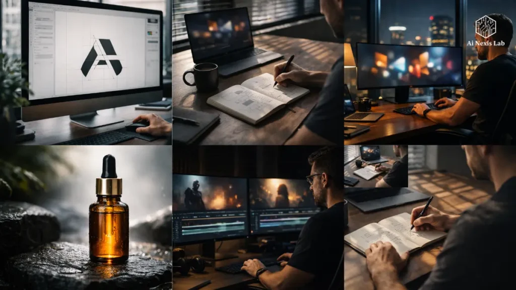
3. High-End Photography Without a Photoshoot
A professional lifestyle shoot in the U.S. can cost $8,000–$25,000 when you factor in talent, location, lighting, and editing.
In 2026, it is optional – not mandatory.
But here’s the catch:
AI photos often look sterile.
The key is not generation. It’s direction.
Consistency: The “Model” Strategy
If you’re building a personal brand, consistency is key.
Usage:
- Character Reference Features
- Seed Locking
- Controlled Lighting Prompt
Instead of:
“Smiling businesswoman in office”
Try:
34-year-old Latina founder in charcoal tailored blazer, natural window light from left, shallow depth of field, Canon RF 50mm f/1.2 exposure, minimal retouching, subtle skin texture
Realistic lens. Realistic lighting cues.
This is how you avoid the “AI face” look.
Lighting Is Eeverything
In 2026, realistic lighting is the biggest difference between amateur and premium AI visuals.
Golden Hour
- Warm
- Emotional
- Human
- Ideal for lifestyle and founder brands
High-key
- Clean
- Corporate
- SaaS-friendly
- Healthy
Chiaroscuro
- Dramatic
- Premium
- Luxury brands love this
If your lighting direction is not specified, the output will default to Normal.
Example: Luxury Skincare Launch
Instead of:
“Woman applying face cream”
You generate:
Macro photography of amber glass serum bottle on wet basalt stone, morning dew, diffused sunlight, natural film grain, 35mm realism, shallow depth of field
Now that looks editorial.
Now that looks exclusive.
Now that looks expensive.
And no one else has that particular asset.
4. Establishing a Storytelling Voice with LLMs
This is where most founders fall short.
Their visuals say “luxury.”
His caption says “Hey guys! So excited to share…”
That mismatch kills credibility.
Don’t Use AI as a Ghostwriter. Use It as a Strategist.
Instead of:
“Write a blog about AI branding.”
Try:
I am the founder of an AI consultancy serving U.S. startups. My tone is direct, skeptical of hype, technically knowledgeable but accessible. I avoid fluff and corporate buzzwords. Outline an in-depth article that challenges common branding mistakes.
You’re directing now.
No outsourcing thinking.
90/10 Rule
Give AI structure.
You inject humanity.
Add:
- Real frustration.
- Late-night doubts.
- The business transactions you have made.
- The mistakes you have corrected.
AI cannot reliably replicate live stress.
That 10% is what separates “content” from resonance.
5. Video Wealth: The New Frontier (2026 Reality)
Short-form video dominates.
By 2026:
- More than 70% of U.S. consumer internet traffic will be video-based.
- Instagram Reels, YouTube Shorts, and TikTok Drive Discovery.
You don’t need a production team.
You need a workflow.
B-Roll Mastery
Workflow Example:
- Write a script.
- Generate voiceovers (ElevenLabs-level quality).
- Generate visuals with:
1) Runway Gen-3
2) Luma
3) Cling - Edit in Capcut or Premiere.
Instead of stock footage, you generate custom B-roll that aligns with your brand palette and lighting direction.
Consistency is what creates identity.
“Impossible” Shots
In 2020, a CGI ad featuring a car driving through liquid gold will cost millions.
Now?
That’s a prompt.
Use this sparingly.
If everything is epic, then nothing is epic.
6. Website Architecture and UI/UX
Your website is the headquarters of your brand.
Templates are fine.
Generic templates are not.
Tools like Framer AI accelerate layout creation.
But here’s the mistake:
People accept the first output.
You need to:
- Adjust the distance.
- Increase white space.
- Limit color usage.
- Standardize the border radius.
- Create custom iconography aligned with your visual anchors.
AI creates the skeleton.
You improve posture.
7. Scaling Content with a Multiplier Effect
This is leverage.
A long-form piece consists of:
- 10 LinkedIn posts
- 5 X threads
- 3 newsletter breakdowns
- 2 short-form video scripts
- 1 carousel post
But visual consistency is important.
Usage:
- Same hex codes
- Same shadow depth
- Same lighting cues
- Same typography scale
That repetition creates brand silence.
People recognize you before they even read.
8. Ethics, Legality, and the “Unusual” Pit
You can’t ignore this.
Avoiding “AI Smell”
Fix:
- Hands
- Teeth
- Eye Asymmetry
- Smoother Skin
Add:
- Grain
- Subtle Imperfections
- Realistic Shadow Noise
More Polished Fake-Like.
Legal Reality in the US (2026)
As of 2026:
- Pure AI-generated images without human modification still face copyright limitations.
- Significant human acquisition strengthens defensiveness.
- Trademarks apply to use in commerce, not just artistic originals.
Always:
- Run a trademark search.
- Modify AI output in Illustrator.
- Avoid copying the styles of living artists.
You are building a brand. Don’t gamble on legal gray areas.
Common Pitfalls (Extended)
1. Over-Generating
You don’t need 500 assets.
You need:
- 8-12 hero visuals.
- 1 clean logo.
- 1 strong typography system.
Restraint is what makes brands feel premium.
2. Ignoring Typography
AI struggles with complex typography.
Invest in:
- Professional fonts.
- Clean kerning.
- Strong hierarchy.
Typography often communicates more than imagery.
3. Losing the “Why”
AI can imitate vocalizations.
It cannot generate certainty.
If you don’t know:
- Why you started.
- Who you are for.
- What you stand for.
Your brand will feel hollow.
Frequently Asked Questions
Is using AI for branding a scam?
No. Tools evolve. The market doesn’t reward effort – it rewards clarity and resonance.
Designers moved from the drafting table to Adobe. Photographers moved from film to digital. AI is another acceleration layer.
“Fraud” is simply pretending that the output creates value. It doesn’t. Strategy creates value. AI reduces friction.
How can I avoid looking like all the other AI-powered brands?
Specificity.
Common signs create common scenes.
Usage:
1) Real lens references.
2) Real materials.
3) Specific decades.
4) Geographic anchors.
5) Controlled palettes.
Most people won’t go into depth. If you do, you automatically make a difference.
Can I trademark an AI-generated logo?
You can trademark a logo used in commerce.
But copyright protection remains limited for purely AI output without meaningful human modification.
Best practice:
1) Redraw or heavily refine in Illustrator.
2) Ensure uniqueness.
3) Do a proper trademark search in your category.
Don’t cut corners here.
Will AI replace brand strategists?
No.
But strategists who reject AI will become ineffective.
AI Handles:
1) Repetition
2) Drafting
3) Search
4) Asset Scaling
Human Handles:
1) Positioning
2) Emotional Intelligence
3) Long-Term Story
The future belongs to hybrids.
What is the most important tool for beginners?
Visual tools.
Because vision is immediate.
If your visuals look great, people assume competence.
But tools don’t produce taste.
Develop them.
Final Verdict: The Barrier Is Gone. The Bar Is High.
In 2026, team size does not determine brand scale.
Clarity does.
Flavor does.
Restraint does.
AI lets you build faster than ever before. But it also immediately exposes laziness.
If your brand looks ordinary, it’s not the tool’s fault.
It’s the direction.
Define your visual anchors.
Choose your archetypes.
Set your lexicon boundaries.
Then generate with intent.
And edit mercilessly.