Beyond the Plastic: Mastering Hyper-Realism in Midjourney v7
Learn 7 proven Midjourney v7 hyper realism techniques to craft ultra-realistic AI images with expert prompt strategies, lighting, camera logic & flaw-driven realism.
The first time an AI image really made me pause, it wasn’t because it was beautiful.
It was because it was wrong – the way real life is wrong.
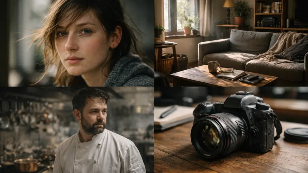
A strand of hair sat awkwardly on the subject’s forehead. Not styled. Not intentionally. Just… there. The lighting didn’t entirely flatter the face. One eye caught a little more light than the other. The skin wasn’t smooth in the cosmetic-advertising sense; It had texture, unevenness, and the slight redness you see after standing in the sun for a long time.
That image didn’t seem “impressive.”
It looked human.
For years, AI image generation was chasing polish. Perfect skin. Perfect symmetry. Perfect lighting. And every time it got closer, it drifted deeper into the uncanny valley. The result wasn’t realism – it was an ultra-clean, ultra-controlled aesthetic that screamed “artificial” to anyone who had ever held a camera or worked with real photography.
With Midjourney v7, something finally changed.
Not because the images are sharper.
Not because the resolution is higher.
But because the model now understands something that older models fundamentally missed:
Reality is messy—and reality resides in errors.
That doesn’t mean v7 magically gives you photographic truth by default. It doesn’t. Even if you prompt it the same way it was prompted in 2023, you’ll still get images that look like 2023. The model is smarter, but it won’t save you from old habits.
This guide is about breaking those habits.
I’ve spent weeks inside v7, deliberately pushing it to failure—over-prompting, under-prompting, breaking symmetry, forcing optical edge cases, testing lighting logic, abusing parameters, and comparing results against real, unedited photography. What follows is not a theory. It really moves the needle from “nice AI image” to “wait… who shot this?”
Table of Contents
1. The End of Sankalp Puja
For a long time, Midjourney felt like writing marketing copy.
“8K.”
“Ultra-detailed.”
“Ultra-realistic.”
“Masterpiece.”
Those words worked – not because they meant anything technical, but because earlier models relied too heavily on visual stereotypes. “High quality” meant sharp edges, high contrast, saturated colors, and cosmetic perfection. It looked good at first glance, especially on social media.
But it never looked real.
In Midjourney v7, those words are actively counterproductive.
Why “8K” and “Masterpiece” Now Hurt Your Results
v7 interprets the prompt more literally and in a more contextual way than previous versions. When you say “masterpiece,” you’re not saying it’s real – you’re saying it refers to what humans have historically labeled as masterpieces. That data turns to:
- Stylist art
- High-grade photography
- Cinematic stills
- Digital image aesthetics
The model is not wrong. You are wrong.
If your goal is realism, you don’t want AI to perform at a quality level. You want it to simulate physical capture.
It means shifting from descriptive fluff to process language – that’s how photographers think.
2. Raw mode is no longer optional
The single most important change in the v7 Realism workflow is this:
--Style Raw is no longer an option. It’s a requirement.
Raw mode disables Midjourney’s built-in aesthetic bias. Without it, the model still beautifies images in subtle ways – boosting contrast, smoothing transitions, and idealizing surfaces. That’s good for art. It’s poison for realism.
Think of it this way:
- Default style: The model tries to look good
- Raw style: The model tries to look accurate
Accuracy is what you want.
What Raw Mode Really Changes
With --style raw, you’ll see:
- Skin texture becomes uneven rather than airbrushed
- Lighting is flattened a bit (which is more realistic)
- Highlights come out more naturally
- Shadows retain their tone rather than becoming velvety smooth
- Colors lose that “AI saturation curve”
If your images look too clean, too shiny, or too symmetrical, Raw mode is the first fix – not an optional tweak.
Stylize: The Silent Killer of Reality
Midjourney’s default --stylize value is still tuned for artistic output. In v7, higher stylize values push the model towards interpretation rather than simulation.
For realism:
- Sweet spot:
--stylize 50–150 - Above 250: You’re asking for stylization, whether you realize it or not
Lower stylization doesn’t make images boring. It makes them authentic.
3. Reality lives in asymmetry
Hands are no longer a problem.
v7 has largely solved that.
Now the real gift is the balance that is so perfect.
Real faces are not symmetrical.
Real rooms are not lit evenly.
There is visual noise in a real environment.
AI images fail when everything appears intentional.
Micro-Flaws: Anchors of Reality
If you want images that pass scrutiny, you must signal imperfections—specifically, imperfections that humans subconsciously expect.
Examples that actually work in v7:
Skin
- Visible pores
- Uneven skin tone
- Slight redness around the nose
- Thin facial hair
- Minor blemishes
Hair
- Stray hairs catching light
- Flyaways
- Uneven hairline
Eyes
- Asymmetrical reflections
- Slight moisture
- Imperfect iris texture
Environment
- Dust in light beams
- Scuffed surfaces
- Clutter that isn’t centered
- Wear patterns on objects
These details do not make the images worse. They make them more believable.
When you remove all the imperfections, the brain flags the image as artificial – even though it can’t explain why.
4. Stop describing the mood. Describe the physics.
One of the biggest mistakes people make is trying to “vibe” into reality.
“Mood lighting.”
“Cinematic atmosphere.”
“Dramatic feeling.”
These words do not describe how light behaves. They describe how humans interpret finished images.
v7 responds better when you describe the optical cause, not the emotional effect.
Think like a camera, not a viewer
Instead of:
Cinematic portrait with dramatic lighting
Use:
85mm lens, shallow depth of field, side-lit by late afternoon sun through a window
Why this works:
- Lens depth dictates behavior
- Light direction dictates shadow logic
- Time of day dictates color temperature
The model now understands these relationships much better than before – but only if you give it the right inputs.
5. Camera language that really matters
Not all camera contexts are created equal. Some trigger real optical behavior. Others are simply aesthetic shortcuts.
Here are the things that consistently produce realistic results in v7:
Effective camera prompts
- 35mm lens – natural perspective, minimal distortion
- 50mm lens – neutral framing, human-eye-like
- 85mm f/1.8 – portrait compression, shallow depth of field
- f/5.6–f/8 – realistic sharpness without artificial blur
Film stock references are also important, but only when combined with realistic lighting.
- Kodak Portra → Soft highlights, warm skin tones
- Fuji Velvia → High contrast, saturated greens
Used sparingly, these references ground the image. With excessive use, they turn into filters.
6. Personalization is not a trick
--p parameter is one of the most misunderstood features in v7.
It does not “improve” images.
It biases the decisions you consistently rate highly.
If your ranking leans towards stylized images, --p will strengthen it. If you deliberately train it on realistic photography, it becomes a powerful reality amplifier.
How to use personalization correctly
If realism is your goal:
- Ranking only real photographs for at least an hour
- Avoid anything overly processed
- Prefer images with imperfect lighting and texture
- Then use
--pconsistently
This does not replace a good signal. It reduces friction.
Think of it as training the model to stop fighting you.
7. Context defeats composition
A dead giveaway in AI images is the background.
You’ve seen it: a perfect subject floating in an environment that seems blurry, colorful, or unrelated. That’s not reality – that’s loneliness.
v7’s zoom out and pan tools are no longer just canvas expanders. It is a reference generator.
Why Zoom Out Works
When you zoom out from a strong base image, v7 preserves:
- Lighting logic
- Depth of field
- Texture consistency
The result looks like the photographer is stepping back – not like an AI is searching for the backdrop.
This is especially powerful for portraits, interiors, and documentary-style images.
8. Multi-prompting for physical separation
When scenes get complex, single prompts collapse physics.
Colors bleed.
Lighting distorts things.
Everything starts to share the same visual weight.
Multi-prompting fixes this.
Example:
subject:: woman in crimson silk dress
environment:: dense green forest
camera:: 35mm photography, natural daylight
This model says:
“These elements coexist, but they do not overwrite each other.”
Weight allows you to fine-tune dominance without distorting reality.
9. Upscaling without image degradation
The biggest reality mistake of the next generation is over-processing.
Upscale (creative) adds details that were often not implied by the base image. It’s great for art. Bad for photos.
Upscale (subtle) preserves:
- Original composition
- Noise pattern
- Edge softness
Real photos are not razor-sharp everywhere. They’re selectively imperfect.
If everything is crisp, nothing is reliable.
10. Reality Stack That Actually Lasts
Here is a parameter stack that works consistently:
[subject + action]
[lens + film stock]
[lighting direction]
--style raw
--v 7
--stylize 50–150
--chaos 5–10
--ar 3:2 | 4:5 | 16:9
Chaos at low values introduces subtle differences without breaking logic.
The aspect ratio aligned with the real camera quietly reinforces authenticity.
Frequently Asked Questions
Q: Why do my images still look too simple?
A: Because you are either:
1) missing –style raw, or
2) using high—stylize, or
3) promoting beauty over physics
low stylize, remove fluff, describe light direction.
Q: Does word order matter in v7?
A: Yes. Heavy.
Initial signs carry more weight. Start with the physical subject or scene – not with adjectives.
Q: Can the v7 really match real photography?
A: Under controlled conditions, yes—especially portraits, still lifes, interior paintings, and documentary-style scenes. Action photography and complex crowd motion still reveal limitations.
Q: Are cinematic realism and photographic realism the same?
A: No. Cinematic lighting is exaggerated by design. Photographic reality is limited by physics.
If it looks like a movie still, it’s probably not real.
Q: Should I always use film stock references?
A: No. Use it when you want subtle color behavior – not as the default.
Final Verdict
Midjourney v7 is not magic.
It is a more honest engine.
If you prompt like a marketer, you will get marketing images.
If you prompt like a photographer – respecting light, optics, imperfections and context – you will get results that pass as quietly realistic.
The era of shouting adjectives at AI is over.
Realism now comes from precision, restraint, and physical logic.
Stop chasing perfection.
Start pursuing the truth.
